Our ability to deliver innovative customer solutions across the world has secured our reputation as a leading presence in the global oil market.
Our mission is to conduct business responsibly, placing excellence, integrity and philanthropy at the heart of everything we do.
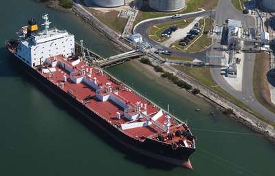
The Prax Group’s core business is refining, logistics, and integrated supply and optimisation; our assets and investments complement and enhance these activities.
The Group has 1,250 employees in 12 offices across 7 countries. The Group’s downstream marketing and distribution businesses carry the Harvest Energy brand.
Its midstream and upstream businesses, including refining and blending, carry the Prax brand. The Group is collectively identified as the Prax Group.
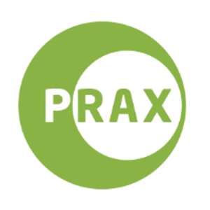 |
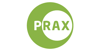
The outer circle of the Prax logo is reminiscent of the globe and depicts endurance. The inner circle represents a bird’s eye view of an oil storage tank; this lean but incredibly strong structure epitomises the collective strength of the Group. The colour green suggests a connection to nature and the environment, while the name Prax is taken from the first initials of members of the founders’ families. |
|
|
|
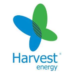 |
Butterflies play a number of important roles in the ecosystem and from ancient times, the remarkable metamorphosis from chrysalis to butterfly has been used to illustrate rebirth and transformation. The Harvest Energy butterfly logo represents the continuous, steady evolution of the business and enhances its environmental credentials. |
|
|
|
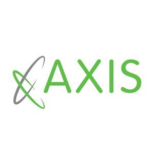 |
Axis Logistics is a seal of approval and a promise of quality and expertise. An axis is the invisible line around which an object rotates, much like the rotating elliptical circles of our logo, which symbolise the speed, power and innovation for which the company is renowned, serving the fast pace and demands of the changing energy industry. The colour green represents our commitment to minimising, as far as possible, our impact on the environment. |
|
|
|
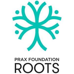 |
The concept behind the design of the Prax Foundation Roots logo is a tree, which has strong foundations and branches made up of the children that the charity supports. The tree represents their personal growth, and the help and support they are offered in order to put down solid roots of their own. It is also reflective of the charity name, which stems from the fact that our trustees have roots in Sri Lanka. |
|
|
|
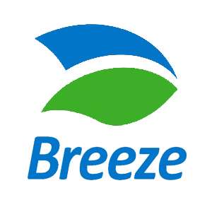 |
The Breeze logo depicts two leaves, used in different colourways – blue and green – representing the synergies between the brand and Harvest Energy. The leaves suggest a connection to nature and the environment, while the simplicity of the Breeze logo represents the ease and efficiency of using our facilities. |